Last Updated 2011/10/13
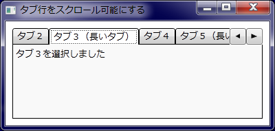
タブ数が多くてコントロールの幅を超える場合、タブコントロールの標準の動作はタブを複数行で表示します。ここではタブを 1 行表示のままスクロールする手順を説明します
.NET Framework の System.Windows.Forms.TabControl コントロールのほうには Multiline プロパティがあって、タブ数が多い場合、このプロパティに false を設定するとタブは 1 行のままスクロール可能になります。true の場合は複数行で表示されます。
一方、System.Windows.Controls.TabControl コントロールのほうにはそのような機能はありません。そこで、作ってみました。実行結果は以下のとおりです。
リソースディクショナリファイルでタブコントロールのスタイルを再定義します。ポイントは TabPanel コントロールの代わりに ScrollViewer コントロール内に TabItem オブジェクトを配置するようにし、スクロールするための RepeatButton コントロールを配置する点にあります。
<ResourceDictionary
  xmlns="http://schemas.microsoft.com/winfx/2006/xaml/presentation"
  xmlns:x="http://schemas.microsoft.com/winfx/2006/xaml">

  <Path x:Key="arrowLeft" Stroke="Black" Fill="Black" Stretch="None"
	VerticalAlignment="Center" HorizontalAlignment="Center">
    <Path.Data>
      <Geometry>M0,3 L6,6 6,0Z</Geometry>
    </Path.Data>
  </Path>
  <Path x:Key="arrowRight" Stroke="Black" Fill="Black" Stretch="None"
	VerticalAlignment="Center" HorizontalAlignment="Center">
    <Path.Data>
      <Geometry>M0,0 L6,3 L0,6Z</Geometry>
    </Path.Data>
  </Path>

  <Style x:Key="{x:Type TabControl}" TargetType="TabControl">
    <Setter Property="BorderBrush" Value="Black" />
    <Setter Property="BorderThickness" Value="1,0,1,1" />
    <Setter Property="Template">
      <Setter.Value>
        <ControlTemplate TargetType="TabControl">
          <Grid ClipToBounds="True" SnapsToDevicePixels="True" KeyboardNavigation.TabNavigation="Local">
            <Grid.RowDefinitions>
              <RowDefinition Height="24" />
              <RowDefinition />
            </Grid.RowDefinitions>

            <DockPanel Grid.Row="0" Height="{TemplateBinding TabPanel.Height}">
              <RepeatButton Name="rightButton" Width="24" Height="24" VerticalAlignment="Bottom"
                          Content="{StaticResource arrowRight}" DockPanel.Dock="Right"
                          CommandTarget="{Binding ElementName=scrollViewer}"
                          Command="ScrollBar.LineRightCommand" />
              <RepeatButton Name="leftButton" Width="24" Height="24" VerticalAlignment="Bottom"
                          Content="{StaticResource arrowLeft}" DockPanel.Dock="Right"
                          CommandTarget="{Binding ElementName=scrollViewer}"
                          Command="ScrollBar.LineLeftCommand" />
              <ScrollViewer Name="scrollViewer" CanContentScroll="True"
                          IsDeferredScrollingEnabled="False" SnapsToDevicePixels="True"
                          HorizontalScrollBarVisibility="Hidden" VerticalScrollBarVisibility="Disabled">
                <StackPanel Orientation="Horizontal" IsItemsHost="True" />
              </ScrollViewer>
            </DockPanel>

            <Border Name="ContentPanel" Grid.Row="1"
                      BorderThickness="{TemplateBinding Border.BorderThickness}"
                      BorderBrush="{TemplateBinding Border.BorderBrush}"
                      Background="{TemplateBinding Panel.Background}"
                      KeyboardNavigation.TabIndex="2"
                      KeyboardNavigation.TabNavigation="Local"
                      KeyboardNavigation.DirectionalNavigation="Contained">
              <ContentPresenter ContentSource="SelectedContent"
                            Content="{TemplateBinding TabControl.SelectedContent}"
                            ContentTemplate="{TemplateBinding TabControl.SelectedContentTemplate}"
                            ContentStringFormat="{TemplateBinding TabControl.SelectedContentStringFormat}"
                            Margin="{TemplateBinding Control.Padding}"
                            SnapsToDevicePixels="{TemplateBinding UIElement.SnapsToDevicePixels}" />
            </Border>
          </Grid>
        </ControlTemplate>
      </Setter.Value>
    </Setter>
  </Style>

  <Style TargetType="TabItem">
    <Setter Property="BorderThickness" Value="1"/>
    <Setter Property="BorderBrush" Value="Black"/>
    <Setter Property="VerticalContentAlignment" Value="Center"/>
    <Setter Property="HorizontalContentAlignment" Value="Center"/>
    <Setter Property="Margin" Value="0" />
    <Setter Property="Template">
      <Setter.Value>
        <ControlTemplate TargetType="{x:Type TabItem}">
          <Border CornerRadius="3,3,0,0" Background="{TemplateBinding Background}"
                    BorderBrush="{TemplateBinding BorderBrush}"
                    BorderThickness="{TemplateBinding BorderThickness}"
                    Padding="{TemplateBinding Padding}">
            <ContentPresenter ContentSource="Header"
                                HorizontalAlignment="{TemplateBinding HorizontalContentAlignment}"
                                VerticalAlignment="{TemplateBinding VerticalContentAlignment}"/>
          </Border>
          <ControlTemplate.Triggers>
            <Trigger Property="IsSelected" Value="True">
              <Setter Property="Background" Value="{Binding Background}" />
              <Setter Property="BorderThickness" Value="1,1,1,0"/>
            </Trigger>
          </ControlTemplate.Triggers>
        </ControlTemplate>
      </Setter.Value>
    </Setter>
  </Style>

</ResourceDictionary>
Window x:Class="TabControlTest.MainWindow"
    xmlns="http://schemas.microsoft.com/winfx/2006/xaml/presentation"
    xmlns:x="http://schemas.microsoft.com/winfx/2006/xaml"
    Title="タブ行をスクロール可能にする" Height="300" Width="400">

  <!-- ScrollableTabControl.xaml のリソースを読み込む -->
  <Window.Resources>
    <ResourceDictionary>
      <ResourceDictionary.MergedDictionaries>
        <ResourceDictionary Source="ScrollableTabControl.xaml"/>
      </ResourceDictionary.MergedDictionaries>
    </ResourceDictionary>
  </Window.Resources>

  <TabControl Margin="10">
    <TabItem Header="タブ1">
      <TextBlock Text="タブ1を選択しました" />
    </TabItem>
    <TabItem Header="タブ2">
      <TextBlock Text="タブ2を選択しました"/>
    </TabItem>
    <TabItem Header="タブ3(長いタブ)">
      <TextBlock Text="タブ3を選択しました"/>
    </TabItem>
    <TabItem Header="タブ4">
      <TextBlock Text="タブ4を選択しました"/>
    </TabItem>
    <TabItem Header="タブ5(長いタブ)">
      <TextBlock Text="タブ5を選択しました"/>
    </TabItem>
    <TabItem Header="タブ6">
      <TextBlock Text="タブ6を選択しました"/>
    </TabItem>
    <TabItem Header="タブ7">
      <TextBlock Text="タブ7を選択しました"/>
    </TabItem>
    <TabItem Header="タブ8">
      <TextBlock Text="タブ8を選択しました"/>
    </TabItem>
  </TabControl>
</Window>
−以上−